Once you have written a book, and you know it is going to be published, then you have to think about what your book is going to look like.
Of course, the cover needs to reflect what the book is about, but most importantly it needs to grab the attention of potential readers, to make them want to pick your book out of millions of others on offer.

Covers are a very personal thing and Rod and I have some experience in this field. I’ve previously written “Glass Bead Jewelry Projects” and have battled with the GMC (Guild of Master Craftsmen), the publishers of the book and their designers about the layout, the formatting of my photographs of the beads and jewellery featured in the book and the cover. Having done all my own photography I was keen these were featured on the cover and though, initially, GMC suggested using their own photographer to take cover shots when they saw my masterworks … False modesty aside, the great thing was that GMC made these into a very arresting cover.

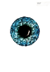
Rod has written and had published the “Demi-Monde” series and “Invent-10N”, and a lot of work has gone into the covers for those books. The Invent-10N cover, created together with Nigel Robinson of “Everything But The Product”, is especially close to my heart: it uses lots and lots of tiny photos of me when I was singing jazz. They are arranged in the shape of an eye, echoing one of the main themes of the story: beware, PanOptika are watching you.

And talking of jazz, even before I started writing, Rod and I recorded and produced the “Jazz Noir” album. The front cover of the CD shows my profile with a surrounding pattern of a strange design: is this flowers, or tiny paper cut-outs, or what? In fact, the young designer who we were working with on the artwork was very inventive. In order to get this strange pattern, he apparently grew some moss around the photo … a vegetarian CD cover no less!.

For “Ghost Love” I was looking for something that would portray ever-lasting love, but also that would alert the reader about the slightly super-natural aspect of the story. After hours of going through various photos and drawings I found this, which I thought reflected the novel’s theme in the best way: [photo]. Two figures, walking hand in hand in Red Square in Moscow, this evidenced by the star on top of the Spasskaya Tower of the Kremlin. In my view, the star needed to be slightly augmented and coloured red. The provenance of the photo is interesting: apparently it was taken on the day of the worst ecological disaster in August 2008, when the peat bogs around Moscow smouldered in the heat of the Russian summer creating this eerie-looking air.
 I had a feeling though that this photo might be a bit too subtle for a paperback cover and so it proved. Phaze obviously thought the Russian connection needed to be emphasized and they did this by incorporating a hammer and sickle into the design. So now we have St Basil’s cathedral with a young woman and a young man, standing together holding hands, surrounded by an aura that represents Tonia’s Shining World. And the hammer and sickle? That’s cleverly been made part of the book’s title. All-in-all a very good cover. Thank you, Phaze!
